
Since 2011, many in the design community have been pushing responsive design to our clients as a “nice-to-have” feature. But in 2014, reality has set in: a responsive website has become an essential part of any company’s online presence.
One area of the Web that is way behind in terms of providing a modern, easy-to-use interface for customers is online retail. Many retailers, even large ones, have not invested the resources to build a responsive estore that works across all device sizes and forms.
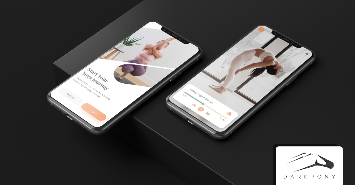
But is a full-blown responsive estore really necessary? I mean who actually puchases something on their phone these days? Everybody knows people just use phones for music, photos and social media – right?
Well, keep reading to see what Amazon has to say about that…
We all know that mobile sales are booming, but it doesn’t hurt to remind ourselves just how big a section of the market mobile actually is.
In 2009, Amazon sold over $1,000,000,000 of merchandise to mobile device purchasers. In 2012, they sold between $3 to $5 billion in annual sales from mobile devices. Yes, that’s right a 5x increase to $5 billion dollars in just 3 years!
On Black Friday in 2013, mobile sales accounted for 21.8% of all online sales. That’s nearly a 43% increase from 2012, according to IBM’s Digital Analytics Benchmark report.
Think about that for a minute…that’s a lot of potential revenue lost if your website isn’t optimized to work well on smaller screen sizes.
One interesting thing to note, is that on Black Friday while mobile traffic accounted for 37% of all online traffic, it only accounted for 21.8% of online sales. This means that some customers are using their smaller devices to browse and price shop their items, but will go to their tablet or desktop later to purchase the items.
That 15% discrepency between traffic and sales probably means we as designers and retailers have some more work to do in optimising our mobile shopping experiences.
One reason for this could be because the checkout process usually requires a customer to fill in many fields with all their purchase info. Filling in forms can be difficult on smaller screen sizes, so customers may just opt to put things in their cart and switch to a tablet or desktop to purchase.
But why should a mobile checkout process be more difficult than a desktop one? Can’t we remove some of that manual fill-in process by using Paypal, Google Wallet, Amazon, or iTunes accounts?
Or how about scanning a customer’s credit card with their camera to make the checkout easier for them? Apple’s latest iOS 8, debuting in the fall of 2014, will have this capability built into Safari.
According to a recent study by Mobify, if your estore is not responsive, 30% of customers will abandon the site before purchasing.
Think about how much money a traditional retailer would lose this next year if every Monday they put a sign in their storefront windows that said “Yes, we’re closed today!” They would not only lose a huge amount of revenue but frustrated customers would go to their competitors instead.
For designers this means we really need to work on our responsive design skills so that we can build better estores, and help clients provide their customers with a better experience. It means we need to learn eccomerce frameworks like Shopify, Magento, LemonStand and Bigcommerce that give you the power to build custom, responsive estore themes.
For online retailers, this means we really need to take stock of our estores and see how well they are optimised to work on all device sizes and forms. We should also take a hard look at how simple and easy it is for customers to buy things from us. Many stores lose countless customers every year because the checkout process isn’t simple and easy, and it takes way too long.
One often overlooked reason to build a responsive ecommerce experience is what it communicates about your brand to your customers. A responsive, small-form first website tells your customers that you care about their needs and habits. More and more people these days are using their phones to perform the majority of their internet tasks. By not catering to people’s needs you are telling them you don’t care about their business and would rather they shop elsewhere.
Not building a responsive estore is like starting a society to promote a healthy lifestyle, and then each week everyone drives their car to the society meeting! Saying you care about customers and want to grow your business is one thing, but does your website really prove it?
A responsive estore that is beautifully designed speaks volumes about your company. It says you are forward-thinking and are actively looking for ways to improve your products and the lives of your customers. It tells potential investors that you care about growing your business. It also lets customers know you are a successful business.
Think about that last statement. Imagine if you heard about this great new coffee shop that someone recommended, however when you went there to purchase some coffee, the sidewalk was filled with trash, all the tables inside were falling apart, and they didn’t have any wi-fi! I think it’s safe to say that most of us would leave and never return.
One of the big pushes in the design community right now is to design sites from a mobile-first small-form perspective. Starting with such a constrained size forces you to think about what really matters to your users. It helps you create a better overall experience for them by starting small and working up, rather than building a large site and then squishing things down for small devices.
One of the big benefits of this way of approaching websites is that it forces you to think of simple solutions for mobile and touch users that will ultimately improve the experience of all your customers.
If you start designing from a large desktop size, you may build a nice-looking header with links, your logo, contact info, cart information etc. But when you try to squish this down to smaller sizes you find out it takes up half the vertical space of your viewport – ouch, that is not very user friendly!
If you instead start from a small-form and think about viewable screen real estate, you would design something simple and short to show only the most important information.
This process forces you to think through what is most important to your users/customers. The simple process of organizing things based on importance goes a long way to helping you design a better, more usable interface across all form factors and sizes.
So you may be thinking great, this article is really needed for companies like Apple, Walgreens and my local bagel-shop but what does it mean to me as a web designer?
This lack of well-designed, super user-friendly, fast loading, responsive estore means there is a huge opportunity for you as a designer to seize on. Many, many companies have not built a responsive estore, nor do they even know why they should. You as a designer can come alongside as a valuable business consultant and help educate them and show them where the market is headed.
This also means you could probably focus all your energies on redesigning old fixed-width estores and have enough work to keep you busy for the next 2 years. Now what were you saying the other day about needing more clients?!
[ via webdesignerdepot.com ]